Branding Tenuta San Giorgio
Winemakers in Papadopoli

Works
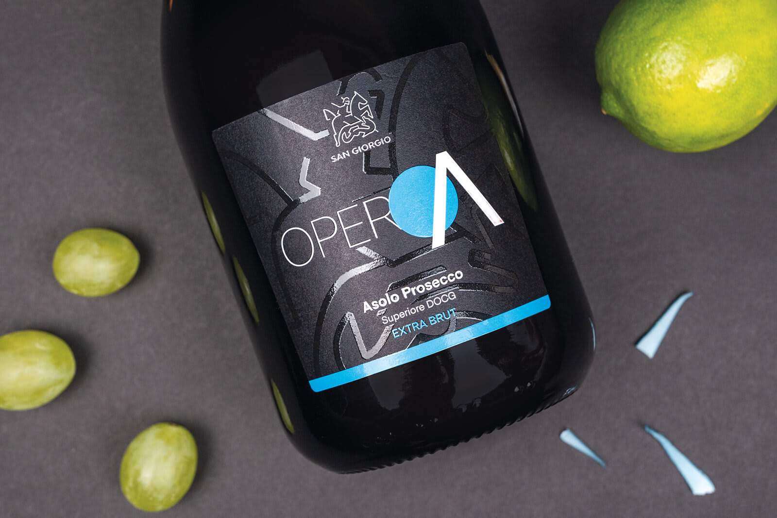
Tenuta San Giorgio is a historic winery that has its roots and those of its vines in Grave di Papadopoli, a small river island that divides the Piave River into two branches: here, a particular terroir gives their wines an unparalleled minerality and fragrance. For TSG's corporate image we were inspired by the terroir, which, just as it makes the wines unique, becomes a distinctive element to dress the bottles and more.

A unique territory, three visual routes
The characteristic territory where the Tenuta is located has been interpreted and graphically declined on three lines of labels, one for each type of wine: sparkling, still, Riserva. For the sparkling, the graphic element is abstracted from the path traced by the waters of the river; each label features a different colour and immediately recognisable details. For the still wines, we opted for a restyling of the existing labels, reproducing the bed of the river Piave with UV-thickened varnish and using gold foil in the company's signature shade. Restyling also for the Riserva bottles, in which we declined the stylization of the bed of the Piave differently and used thickened varnish and gold foil. The river element (together with the pictogram) was also taken up on the boxes for transporting the wines - designed starting with a study of the die-cuts, to make them suitable for holding the different types of bottles and different quantities - and finally on the cover of the catalogue, where the brand colours and an emotional narrative present the company and its history, and then the references.